Tom Ford Era Gucci Lookbooks

When it came to womenswear, Tom Ford knew that sex sells. Inspired by the golden era of late 70s nightclubs like Studio 54, Ford took disco sensibilities and mixed them with power suiting, inspired by his love of 60s mod tailoring. Blended with provocative cuts in sumptuous fabrics, Ford established “The New Sexy,” one that was luxurious yet louche.

S/S ‘00 found Ford at his most reverent to the disco days, with models strutting in snakeskin dresses and shirts with plunging necklines, paired with equally vibrant stockings. Lounging sets were aggrandized with liquid-like silks and slacks covered with sequins. Swimwear was skimpy and low cut, strappy around the ribs and stomach to accentuate the waistline.

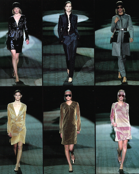
The following autumn, Ford presented a more formal collection, ranging from enveloping cashmeres to rugged motowear, ending with a series of eveningwear dresses, rompers, and high necked overcoats. The plunging necklines were now ruffled, layered under a velvet suit set with a strong shoulder. Ford opted for a comparatively muted palette, replacing deep blues and saturated pinks from the prior season with black and white outwear, with occasional pops of mustard and gold for geometric patterning on dresses.

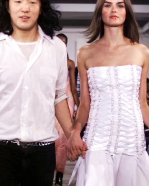
S/S ‘02 was a relaxed offering from Ford. Shirts and coats were worn untied and flowed loosely, in natural off-whites and paired with bamboo heeled clogs and raw suede bags. Jackets sported hooks and buckles instead of typical button closures. Dresses and skirts were cut asymmetrically, often paired with cutouts of flowers and hearts.

Tom Ford’s Gucci spanned a range of aesthetics and occasions, but never strayed from its clear vision of the Gucci woman: self assured, unafraid of the spotlight, and, most importantly, glamorous.

Soma Faitanin S/S '26 "Debut"

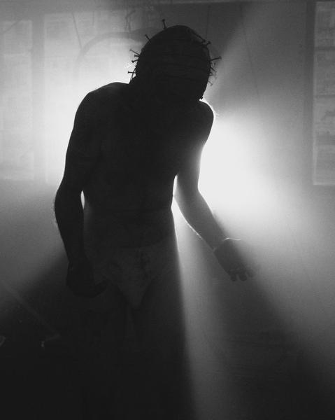
It’s an uneasy scene at Soma Faitanin’s debut show. Algha’s Plantroom, an East London heritage site, has been converted into a post-war landscape. Stepping through strewn about feathers is Faitanin’s eclectic cast of models, adorned in free flowing silks and militaristic leathers. They have mummified hair, electroplated face prosthetics, and move with zombie-like gaits. Their makeup is ghostly and streaked. Some models walk with their hands outstretched as if preaching, or perhaps begging. One is almost naked, only dressed in undergarments and a mask covered in nails. Backed against an overpowering flood light, the otherworldly aftermath of some long gone war becomes visible.

Faitanin’s garments are visibly lived in, distressed and worn in to resemble the clothing she handled during her teenage years working at her father’s vintage warehouse. Outerwear is intentionally aged and pinched at the seams, pockets and other closures worn out and unable to close due to tension. Seam allowances are flipped and hand stitched back down. These heritage garments are reimagined through a queer lens, accessorized with leather jockstraps and corsets, exaggerated with camp sensibilities to create new silhouettes. A single bag is present in the show, a large mass of stitched leathers restrained by carefully knotted ropes, slung over a shoeless model wearing an antique dress.

The show ends on a somber note, with all models cascading down the runway as a mob before disappearing backstage, fading away like a distant memory.

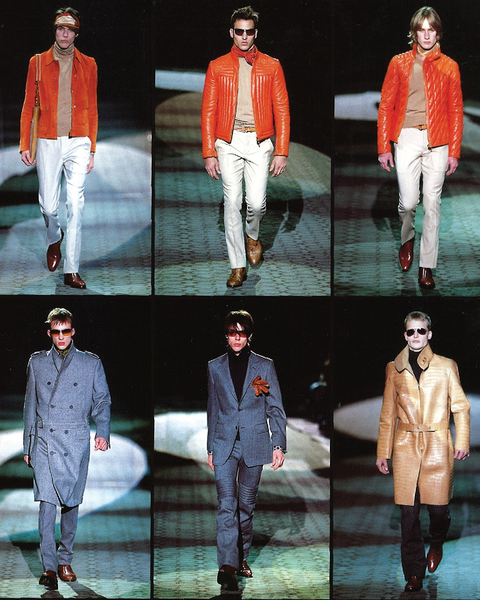
Gucci A/W 2000-2001

Nearing the turn of the millennium, Tom Ford had successfully transformed Gucci from a classic leather accessories house into a brazen provocateur. The Italian heritage leathermaker was now a sex symbol, a brand for the erotic and seductive. Ford understood that for many consumers the clothing often came second to the image, and used his runways to deliver the fantasies he promised in his ad campaigns.

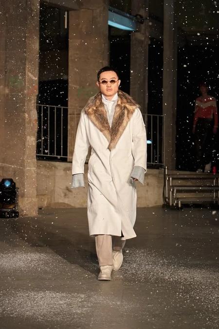
A/W 2000 - 2001 menswear was a more restrained collection from Ford. This season was an exploration of moto wear blended with formal eveningwear; models wore outwear in exotic furs, slim cut slacks that were tight around the crotch, and high necked jackets and coats layered over skin tight turtlenecks. Leather moto pants are a key motif of the season, appearing alongside quilted leathers, fur outwear, and constructed in wool as part of a suiting set.

Ford’s tailoring featured brash geometric patterning over nipped waists and power shoulders, contrasted with bulkier trench coats and double breasted coats that sported large lapels and low slung belts. Knitwear was presented in dress casual, styled over collared shirts and slacks, finished with pointed derbies in a shiny patent leather.

As the show closed, the narrative was clear. The Gucci man was someone who owned animal furs and leathers that commanded eye-watering prices, split lanes on his Ducati, and made it on time to a gala in his velvet suit and bowtie.

Tom Ford's Gucci: S/S '03 "G"

In the midst of fashion’s reorganization into an industry of large conglomerates, Tom Ford pulled Gucci from the brink of bankruptcy to become the foundation for what is now Kering. Ford transformed Gucci into something unabashedly horny, a far cry from the reserved elegance of the brand’s past. Through scandalous ad campaigns and a focus on the sexy, glamorous woman, Ford led the house to an unprecedented level of success; By the early 2000s, Gucci was approaching nearly $3 billion in revenue.

Although Ford’s clothing was provocative on its own, it was his campaigns with Carine Rotifeld and Mario Testino that exposed the consumer’s carnal desires. The ads were pornographic, with Rotifeld’s styling leaving little to the imagination. Silk and satin robes were slung off the shoulder to reveal lingerie, blouses in striking jewel tones were unbuttoned down to the navel. Slim suiting was paired with power shoulders and nipped waists, pants sat low on the hips. The women were rail-thin with shimmering eyeshadow and contoured cheekbones, the men had sculpted abs and chiseled jawlines, and Testino’s photography captured them at their most vulnerable.

S/S ‘03’s campaign is among the most iconic of the two’s work for Ford, featuring legendary models Carmen Kass, Louise Pedersen, Iván de Pineda, and Adam Senn. The spreads are voyeuristic, with models often making direct eye contact with the camera while posing erotically, their garments worn loosely, if at all. The lighting is harsh, exposing the sheer details of the silk garments and accentuating their figures against the set’s backdrop. Perhaps most recognizable from the campaign is the photograph of Carmen Kass and Adam Senn, where Senn is pulling down Kass’ underwear to reveal a G shaven into her pubic hair.

Despite Ford’s radical success at Gucci, he left the conglomerate in 2004 after failed contract negotiations over creative control, and started his own eponymous label the following year.

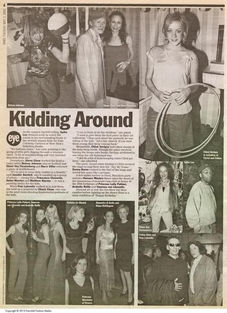
Imitation of Christ

Imitation of Christ founders Tara Subkoff and Matthew Damhave offered a response to the megalomania that was festering in fashion. They started with the clothes themselves, which were made from upcycled secondhand garments - a ‘resurrection’ of cloth. But IOC also attacked the runway, questioning the purpose of the typical catwalk. While the clothes themselves were desirable and well-crafted, it was the transgressive approach of IOC that resonated with the New York Fashion Week circle, despite consistent panning by critics.

Imitation of Christ’s first New York presentation for S/S ’01 was a mock wake held in a funeral parlor, with models wearing the collection as they approached the casket. As each model paid their respects and placed a flower over the deceased, the audience was left to interpret the show how they see fit, with Subkoff and Damhave unwilling to provide any explanation.

Following the previous season, IOC presented their A/W ‘01 show in a theater on 66th. Models walked the red carpet and were photographed by faux paparazzi. After arrival, attendees were asked to make a donation to charities that fought against child labor. The show raised over 25k despite attendees’ frustration with IOC asking for donations on the spot.

S/S ‘02 was perhaps the brand’s most inventive presentation – and also Damhave’s last showing before his departure. Editors and critics were quickly ushered into a room that was already seated by the models wearing the collection, with directions on where to go yelled over the speaker. The models held notepads and cameras, reversing the roles as the journalists were taunted and jeered through both the megaphone and models.

Following Damhave’s exit, IOC stayed their conceptual course. In A/W ‘02, models were auctioned off as pieces of art, standing frozen as they were sold to the highest bidder. The brand continued as a provocateur until IOC was placed on hiatus in 2005, before their 2011 relaunch as Imitation.

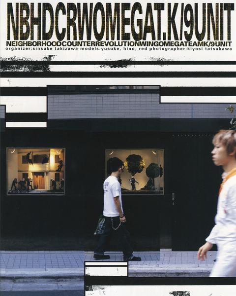
30 Years of NEIGHBORHOOD

The legendary Ura-Hara streetwear brand NEIGHBORHOOD recently celebrated its 30 year anniversary with an exhibition in Laforet, which housed a recreation of the original Harajuku storefront for a week in October. Portraits of Takizawa’s longtime friends and collaborators surround the storefront, next to a series of incense chambers sized up for display.

Initially founded as a project between Takizawa and three of his friends, NEIGHBORHOOD specialized in the rugged and utilitarian, producing collections that Takizawa envisioned as a “complete wardrobe.” Influenced by his love of vintage Americana, punk, moto, and military aesthetics, Takizawa frequently designed with functionality in mind. As a motorcyclist himself, he drew inspiration from the LA biker subcultures of the 60s, often displaying his own bikes in the storefront.

NEIGHBORHOOD also sports a long list of frequent collaborators, perhaps the most iconic of which is Adidas, starting in 2005 with the release of a Superstar model to celebrate the sneaker’s 35th anniversary. The pair sported NEIGHBORHOOD’s logo at the heel, with NEIGHBORHOOD typography along the spare laces. The sole came in an aged off-white look, true to Takizawa’s love of vintage, alongside blacked out three stripes and contrast stitching.

For A/W ‘25, Takizawa collaborated with Y-3 for “Y-3 NEIGHBORHOOD,” a fusion of the two brands under the shorthand Y-3-N. Takizawa and Y-3 tapped into the moto community for this collaboration, including Japanese moto brand Cherryscompany for the campaign’s custom bike and legendary racing gear manufacturer Dainese to develop the collection’s moto apparel.

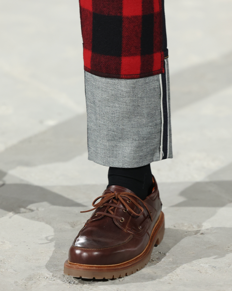
Selvedge Denim on the Runway

Painstakingly crafted on shuttlelooms, selvedge got its name from the self-finishing method along the edge of the fabric, visible at the seam when cuffed at the ankle. Selvedge denim takes on a stiffer, rigid shape due to the low tension weaving process, creating a denser and more durable fabric. While shuttlelooms have been replaced by modern machinery, the technique has seen a resurgence led by artisan makers in Japan.

In homage to the material’s workwear origins, Junya Watanabe’s A/W ‘25 show features a collaboration with Filson, pairing heritage jackets with pairs of selvedge denim. Some pairs sport a standard cuff, while others riff on the tradition by stitching the fold underneath a buffalo check kneepad. Similarly, sacai hybridizes a type 2 denim jacket with a satin bomber in their collaboration with Levis, blending two pieces into something new.

Houses such as Dior elevate selvedge to a more formal context, contrasting the hardy material with smart tailoring. For Dior’s A/W ‘17 show, Maria Grazia Chiuri presented a series of looks entirely in navy blue, with the “J’ADIOR” motif along the selvedge ID.

Rick Owens makes use of a waxed selvedge in his A/W ‘19 show, “LARRY.” Through a slimmer cut of pant and lengthened inseam, the selvedge’s stiffness is exaggerated as it stacks on top of Owens’ Kiss heels, a callback to the rockers from the ’70s and ’80s. Beyond “LARRY,” Owens has continued to create selvedge in various cuts through his collaboration with Self Edge, manufacturing his denim out of Japan’s denim capital, Okayama.

Varied in cut, color and shape, selvedge denim has found a place within high fashion as a symbol of quality craftsmanship and a growing desire for personal, long lasting garments. Find your next pair on Grailed via the link in bio.

Massimo Osti's Stone Island: A Radical Future

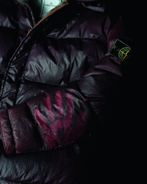
In the early ’80s, Massimo Osti was struggling to figure out how his new creation could fit into C.P. Company. Dubbed “Tela Stella,” the fabric was inspired by the heavy duty tarp typically stretched over military trucks, with a similar handfeel and waterproofing. Osti considered the material to be too far-reaching for C.P. Company, and instead decided to launch it under a new brand, named Stone Island.

The name was pulled from a Joseph Conrad novel, whose maritime past as a merchant marine mirrored Osti’s love for the ocean and sailing. Founded in 1982, the brand was an overnight success, although for all the wrong reasons. Stone Island’s logo, the wind rose, bared resemblance to the Celtic cross, a favorite among the Italian far-right. Worn as a signifier of both financial and political status, Osti spent most of the ‘80s unaware of the connotations the brand had begun to develop.

Following his early success, Osti worked tirelessly to procure his vision for Stone Island as a more radical and experimental counterpart to his work at C.P. Company. Similarly inspired by his deep archive of military garments, Osti would remix details from uniforms and workwear pieces to create his collections, one such example being the Reflective jacket. Osti combined the reflective elements of a fireman jacket with added protection against electro-magnetic fields, a quality typical of fisherman jackets.

Osti rebuked the notion of being a “fashion designer” and considered himself to be an engineer first, only ever presenting his work once in Berlin, as a celebration of 15 years of his work. Against the idea of a traditional runway, Osti instead displayed a series of pieces across all three of his brands - including Boneville, an affordable alternative to both C.P. Company and Stone Island - side by side.

In the end, overwhelmed by the work and its growing disconnect with his own personal values, Osti sold his shares in Stone Island to focus on his own smaller productions, as well as his activism as a member of the Democratic Party of the Left.

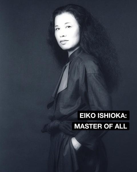
Eiko Ishioka: Master of All

In 1960s Tokyo, graphic design was a man’s pursuit. According to Eiko Ishioka’s father, the field was too ruthless for a woman to find success. But within 5 years of graduating from the Tokyo National University of Fine Arts and Music, Ishioka would go on to win Japan’s most prestigious marketing award while working under Shiseido. Her work there transformed the traditional idea of what a “Shiseido girl” was meant to be. No longer would they be meek and submissive: they’d be powerful and seductive.

Ishiokia’s love for an assertive woman is most visible in her final campaign with Parco, featuring Faye Dunaway. Influenced by the Japanese theatre tradition of Noh, Dunaway gently peels a hard boiled and eats it while making direct eye contact with the viewer. Despite the understated nature of the ad, the sensuality is difficult to ignore.

“Eroticism,” Ishioka said, “is very important in attracting people’s souls.”

Ishioka’s first work in film was production design for Paul Schrader’s “Mishima” which led her to design costumes for Francis Ford Coppola’s interpretation of Dracula. The costuming was vibrant and sculptural, yet soft, and carried the drama central to Ishioka’s work prior, ultimately winning her an Academy Award. Coppola’s vision was that the costumes themselves would serve as the set, the running narrative of “love as an affliction” made visible through the deep reds in the cast’s attire.

Other works of Ishioka include poster design for the Japanese release of “Apocalypse Now”, costuming Tarsem Singh’s “The Fall” and “The Cell”, outfitting the Cirque de Soleil, and dressing the performers for the 2008 Beijing Olympic’s opening ceremony. Ishioka’s final project was costume production for Spider-Man: Turn Off the Dark.

Ishioka, a self-described “nomad creator”, was rarely bound by the mediums she worked in. Effortlessly injecting her vision of rebellion and beauty into everything she touched, Ishioka is remembered as a jack of all trades, master of all.

More Than Meets the Eye: Trompe L'oeil

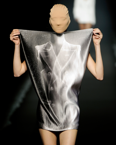
While not the first time trompe l’oeil made its way onto the runway, Martin Margiela’s S/S ‘96 collection is often cited as one of the most impactful. High-contrast photographs of winter-weight garments were printed onto lightweight summer fabrics, juxtaposing the light drape with images of rigidity. For Margiela, whose work challenged the essential nature of garments, trompe l’oeil offered a creative way to give a garment new life.

A year prior, Jean Paul Gaultier designed a series of dresses printed with the outline of a body and bikini using warped polka dots for his F/W ‘95 collection, “Cyber.” The usage of negative space alongside heavy layering pushed the sensuality of the pieces further, despite the wearer being fully clothed.

The influence of both Margiela and Gaultier echoes in the contemporary works of Demna and Glenn Martens. Demna, previously a designer for Margiela’s womenswear, utilized the technique with a contemporary lens at Balenciaga and Vetements. Referencing Margiela, Demna’s usage of the technique blends contrasting elements, such as sweatpants that appear as denim, with his own sense of humor.

First Hand Account of the Balenciaga Exhibition

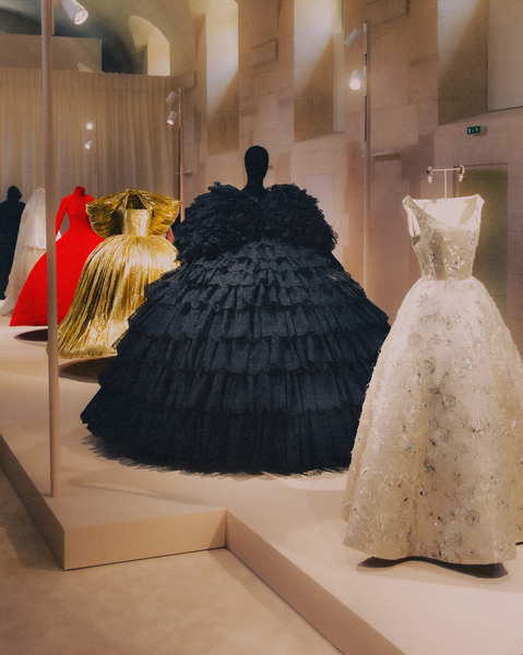
40, rue de Sèvres was actually a hospital for three centuries prior before Kering’s acquisition, but if you didn’t know that you’d assume it was a church first. Despite the house themselves describing the architecture as “sober”, the interior felt quite severe. Past the unassuming courtyard and into the main entrance stretched a great hall with a pulpit to the left and a cross bearing Jesus Christ to the right.

“Didn’t you know? Demna invented Jesus.” my coworker quipped.

Heresy or not, The joke lingered in my head. Demna was one of those designers who had a religious following, myself being a believer. My first experience with the brand was when I witnessed the Balenciaga campaign logo back in 2016. I remember thinking, how could this be fashion? When Bernie Sanders himself was mostly indifferent, my curiosity was only piqued more.

Undercover S/S '06 "T" Lookbook Scans

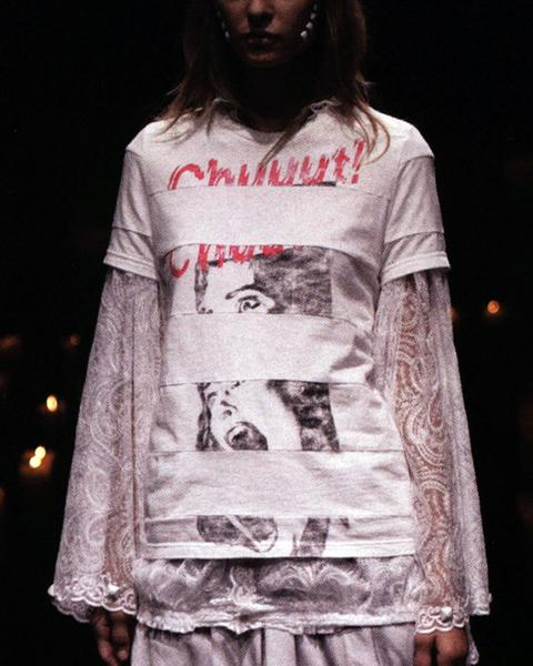
When Jun Takahashi’s Spring / Summer ‘06 show, “T” begins, the room feels heavy. Shirtless models clad in nuncaps surround a menagerie of candles before receding into the darkness. The following models’ garments brandish the names and logos of rock bands: Klaus, The SSSS, The Amazing Tale of Zamiang, Chuuut!, and Theo Burp are the 5 debut acts of the newly-founded Undercover Records. Of course, none of these bands nor the record label exist – they are creations of Jun himself.

Inspired by progressive German rock bands such as Popol Vuh and Embryo, Takahashi created these bands as a way to explore how music and fashion intersect. Interested in the parallels of religion and fandom, Takahashi compared his shows to joining a commune.

Cindy Sherman: Anti-Fashion Portraiture

Now regarded as one of the most important photographers of the 20th century, American artist Cindy Sherman first gained recognition through her body of work named “Untitled Film Stills”. The series featured black and white photographs of Sherman styled as different Hollywood feminine cliches throughout the ‘50s and ‘60s. Through these photographs Sherman questioned her own understanding of womanhood with clothes as a central feature.

Untitled Film Still #21, arguably one of her most important works in the series, features Sherman dressed as a working woman amidst city streets. Her anxious expression and gaze towards an unknown subject instill the photograph with a sense of unease, exaggerated further by the imposing city background. Sherman’s entrapment mirrored a common sentiment that women in Hollywood experienced.

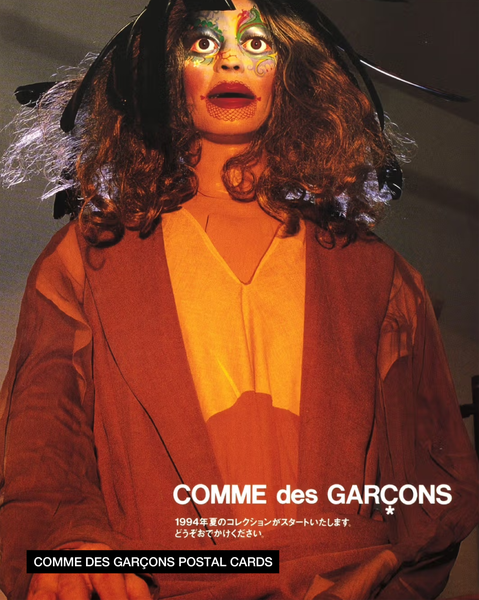
Following “Untitled Film Stills”, Sherman would take a commission from pioneering fashion retailer Dianne Benson. Tasked with creating an ad campaign using clothes from the boutique, Sherman’s Untitled #122 went against all conventions of fashion imagery, featuring herself with a look of murderous intent and clenched fists. After a subsequent spread was published in Harper’s Bazaar, Sherman was approached by Rei Kawakubo for a series of mailers with Comme Des Garçons.

Wim & Yohji: Until the End of the World

As Dommartin approaches Bruno Ganz for the final monologue of ‘Wings of Desire,’ her dress a striking red against the muted amber tones of the bar, she looks determined. According to director Wim Wenders, Dommartin’s nervousness vanished with the dress on, her confidence overflowing as she performed the German dialogue without error. Curious after filming, the director would check the label to see who designed the dress. Upon inspection, Wim Wenders would discover the signature of Yohji Yamamoto along the neck tag.

Uninterested in the world of fashion, Wenders would reluctantly agree to produce Notebook on Cities and Clothes, a documentary where Wenders shadowed Yamamoto for a year, becoming intimately familiar with the designer’s philosophy of clothes as a source of personal identity.

“I felt protected like a knight in his armor. By what? By a shirt and a jacket? The label said, ‘Yohji Yamamoto’. Who was he? What secret had he discovered, this Yamamoto? A shape? A cut? A fabric? None of these explained what I felt. It came from further away... from deeper. This jacket reminded me of my childhood, and of my father. As if the essence of this memory were tailored into it.” - Wim Wenders, Notebook on Cities and Clothes, 1989

Kapital Kountry: Rebuilding Heritage

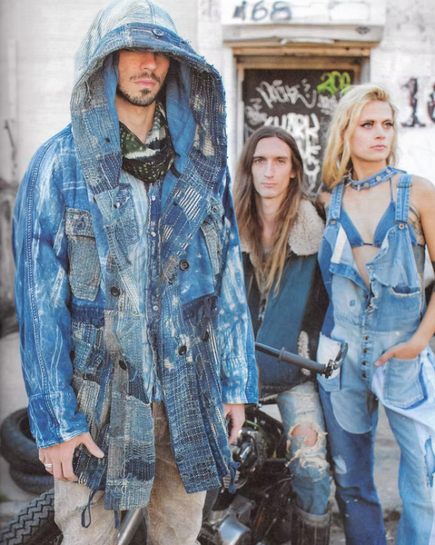
Following a successful start to Kapital in 2002, Toshikiyo Hirata and Kiro Hirata established Kapital Kountry in 2010, a sub-label dedicated to pushing the already iconic aspects of Kapital even further. Kountry focuses on specialized denim-making techniques and frequently reworks existing Kapital pieces to fit the new design approach of the sub-label.

Kountry, as the name implies, has an obsession with western Americana. Deeply important to Kaptial’s canon is denim - both Hiratas had extensive experience with denim production before teaming up at Kapital. Kountry’s denim is given its color through a labor intensive indigo dyeing process designed to then fade over time to the wearer’s body.

Kountry incorporates Kapital’s signature use of boro stitching, where small patches of denim are used to repair pre-existing pieces. Intentional stitchwork, pre-distressing, and extensive patterning gives Kountry’s boro pieces their distinct vintage look.

Paisley patterns can often be seen on outerwear as well as bandanas, a Kapital staple present in both lines. Existing for centuries prior, the paisley was rediscovered in the 1960s during the Peacock Revolution. Originally Persian, then brought to the west to Scotland, and eventually landing in the Americas, the paisley represents Kapital’s fascination with cross-cultural communication.

Alfred Steffen: Portrait of a Generation

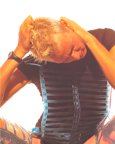
Alfred Steffen’s ‘Portrait of a Generation: The Love Parade Family Book’ gives a brief glimpse into the Berlin parade that brought together a generation of techno enjoyers and club goers. Photographing over 250 ravers, Steffen’s series captures the aesthetic throughline of a culture rejecting conformity.

By 1996, Love Parade had become a staple in the rave scene. The event drew nearly one million attendees from all over the world to celebrate electronic dance music. Oriented around ideas of peace, family, and unity, the parade simulated a society free of the tensions that defined the ‘90s. As the parade marched down Siegessäule towards the Brandenburg Gate, Steffen pulled ravers from the parade and shot them in a studio setup, where he detailed outfits that reflected the collective euphoria towards the future.

A combination of rapid advances in technology and the turning millennia brought a renewed interest in science fiction, bringing style choices that felt distinctly alien and experimental. A tumultuous economic landscape lent to a prominent DIY scene, where ravers were able to express themselves organically while cutting costs. Highly reflective silvers, chrome, and transhumanist garb were often contrasted against colorful outerwear covered in computerized graphics.